
FIFA World Cup Logos
So the FIFA World Cup in Russia is fast approaching in June and its that time of year where the football seems to take over the TV for four weeks (not that I’m complaining) to showcase the pinnacle of football excellence that is ‘The Beautiful Game’. Therefore I’ve decided to take a look into the visual identities of previous Fifa World Cup logos including this years logo for Russia 2018.

Early World cup visual identities are simply poster formats and reflecting the popular design styles at the time. From my knowledge of poster design, the style at the time of the first few world cups (1930-50) were abstract with influences of the art deco style that was popular around that time. Poster design at the time were one of the key visual marketing tools for promoting events as radio was popular and Television was still in its infancy. World cups in 1942 and 1948 were cancelled due to World War II but in these twelve years of no World Cup the visual identity of 1938 and 1950 didn't change much. Its important to know that during these times and up until 1970, the host country had full control over the style and visual identity of the tournament that they were hosting.
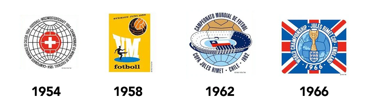
In 1954 the switch from poster to emblem design started to take over with host countries deciding to promote their own national identity within the design by using their country’s colours and flags. World cups from Switzerland 54, Sweden 58, Chile 62 and England 66 all shown these elements of change and localised branding.

Mexico 70 and West Germany 74 was a turning point as simplicity took over by stripping the identity back to a simple shape that didn’t necessarily include the host nations identity. This was followed by an era of simplicity mixed with patriotism which didn’t change for 20 years years. So from Argentina 78 to France 98 it seemed the logo for the World Cup had to include the following: a picture of a football, colours of the host nations flag and the name of the host country. However simple these logos may be, they were at the very least universal which meant that everyone could understand visually where the tournament was taking place. Looking at some of the logos, if you took away the text, would you know where the tournament was taking place?
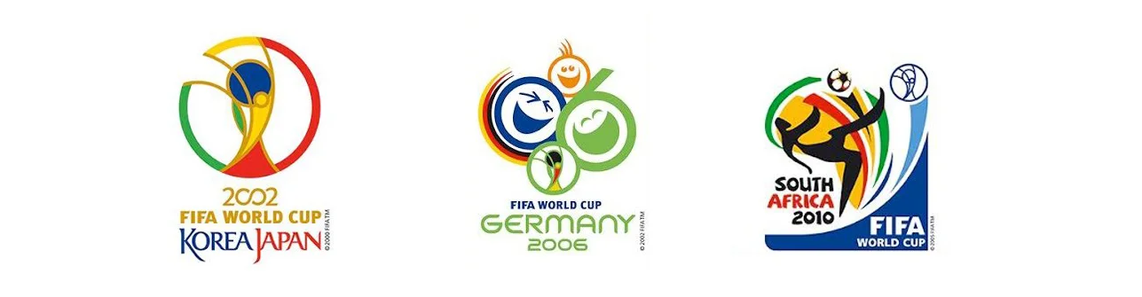
Into the new new millennium the style switched again for Korea/Japan 02, Germany 06 and South Africa 10. Not only did it include the previous criteria of the previous 20 years of simplicity but the identity started to incorporate and reflect the host nations culture through conceptual thinking. For example Andy Milligan who was International Brand manager at Interbrand who design the logo for Korea/Japan 02 said that it “builds on the artistic principles and traditions of Korea and Japan, such as asymmetry, dynamism and harmony, in order to live up to the high quality of design for which both countries are renowned.” Of the Germany 06 logo design, UK agency Whitestone tells us that the message was for Germany to show that they " want to be friendly hosts and celebrate a party with the entire world", hence the laughing and smiling faces. Lastly, the South Africa World Cup logo designer, Gaby de Abreu, co-founder of the Johannesburg based design company Switch Design wanted to promote the message of "peace, progress, excellence and unity of Africa as a continent." In this era of the new millennium of world cup logo design, typography has also been used to also reflect the host country for a more complete final product.

Through this period of conceptual thinking and design it has influenced the way a World Cup logo is created from then on. It has to cover more criteria now than just using colours and a ball, it has to define that host country. It has to have purpose, meaning and pride. It has to reflect the history, culture and the modern values of that country, as well as the tournament itself. Brazil 14 and Russia 18 define this era's criteria. The Brazil 2014 logos the main focus is modernity and diversity. FIFA’s press release about the design states “As well as depicting the uplifting humanitarian notion of hands interlinking, the portrayal of the hands is symbolic of the yellow and green hands of Brazil warmly welcoming the world to Brazilian shores."

Moving onto this years logo for Russia 18, the logo according to Russian Sports Minister Vitaly Mutko, was inspired by "Russia's rich artistic tradition and its history of bold achievement and innovation”. Similar to the Brazil 14 logo in the way that the general shape is of the World Cup thophy itself which is iconic to the tournament and one of the most recognisable trophies in the world of sport. Within that shape it includes the celebration of people scoring a goal which relates to the tournament and Russia love of football. The history and culture aspect lies with the stars that are dotted within and represents Russia’s history of being pioneers and innovators in space exploration. The colours used are of course are reflective of the Russia red, white and blue flag. Lastly a typeface was created to compliment the logo which is called ‘Dusha’ which in Russian means ‘Soul’. With all these well thought out elements combined it creates a solid and worthy icon for the 2018 FIFA World Cup.
The evolution of the world cup logo is interesting as looking from where it started in the first poster, its almost gone full circle to the Russia 18 logo. What I mean by this is although the logos through out the years have gone through many different styles and have added more depth to the thought process, the Russia 18 logo still shares the same abstract feel as the very first world cup poster in 1930. Looking forward to Qatar 2022, it will be interesting to see what design they come up with. Will it have similar properties of the last two world cups or will we be presented with a completely new and iconic logo with a completely new thought process? What ever is presented to us I’m sure that a beautiful logo is needed to reflect ‘The Beautiful game’.